Mastering Pie Charts: A Comprehensive Guide to Creating Pie Charts in Microsoft Excel

-
Quick Links:
- Introduction
- Why Use Pie Charts?
- Understanding Your Data
- Step-by-Step Guide to Creating a Pie Chart
- Customizing Your Pie Chart
- Case Studies and Examples
- Expert Insights on Pie Charts
- Data-Driven Analysis with Pie Charts
- Common Mistakes to Avoid
- Conclusion
- FAQs
Introduction
Pie charts are a powerful way to visualize data, making complex information more digestible. In this detailed guide, we will walk you through the process of creating pie charts in Microsoft Excel, a widely used tool for data analysis and visualization.
Why Use Pie Charts?
Pie charts are particularly useful when you want to show the proportions of a whole. They are ideal for displaying categorical data, where you can easily visualize how each category contributes to the total. Here are some key advantages:
- Simple and intuitive representation of data
- Effective for showing percentage contributions
- Visually appealing and easy to interpret
Understanding Your Data
Before creating a pie chart, it’s crucial to understand the data you are working with. This section will cover:
- Identifying relevant data points
- Organizing your data in Excel
- Choosing the right categories for your pie chart
Step-by-Step Guide to Creating a Pie Chart
Step 1: Open Microsoft Excel
Start by opening Microsoft Excel and entering your data into a new worksheet. Ensure that you have your categories and corresponding values clearly laid out.
Step 2: Select Your Data
Highlight the data range you want to include in your pie chart. This typically includes both the category labels and their corresponding values.
Step 3: Insert the Pie Chart
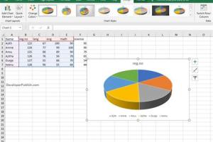
Go to the Insert tab in the Ribbon. Click on the Pie Chart icon. You will see various pie chart options such as 2D Pie, 3D Pie, and Doughnut. Choose the style that best fits your needs.
Step 4: Adjust Chart Elements
Once your pie chart appears, you can utilize the Chart Tools to modify it. This includes adjusting titles, labels, and colors.
Step 5: Finalize Your Chart
Review your pie chart for accuracy. Ensure that data labels are clearly visible and that the chart communicates the information effectively.
Customizing Your Pie Chart
Customization is key to making your pie chart more informative and visually appealing. Here are several customization options:
- Changing Colors: Modify the color scheme to match your presentation or brand.
- Adding Data Labels: Include percentage values or category names for clarity.
- Exploding Slices: Highlight specific slices by pulling them out from the center.
Case Studies and Examples
Let’s explore a few real-world examples of pie charts in action:
Example 1: Sales Distribution
A retail company might use a pie chart to display sales distribution across different product categories. This allows stakeholders to quickly see which categories are performing best.
Example 2: Survey Results
Non-profits often use pie charts to represent survey results, showing the percentage of respondents who support various initiatives.
Expert Insights on Pie Charts
Experts recommend using pie charts when:
- Data is limited to a few categories
- Emphasizing the relationship of parts to a whole
- Visual simplicity is a primary goal
Data-Driven Analysis with Pie Charts
Data-driven analysis using pie charts can enhance decision-making. For example, a business might analyze customer feedback data to inform product development.
Common Mistakes to Avoid
While pie charts can be effective, it’s easy to make mistakes. Avoid these common pitfalls:
- Using too many categories, which can clutter the chart
- Neglecting to label slices properly
- Failing to use contrasting colors for visibility
Conclusion
Creating a pie chart in Microsoft Excel can be a straightforward process if you follow the right steps. By understanding your data and customizing your charts effectively, you can create compelling visualizations that communicate your message clearly.
FAQs
1. What types of data are best suited for pie charts?
Pie charts work best with categorical data where you want to show the proportion of categories within a whole.
2. Can I create a pie chart in Excel on a Mac?
Yes, the process is similar in Excel for Mac, with slight variations in the interface.
3. How do I change the color of a slice in a pie chart?
Click on the slice you want to change, then right-click and select “Format Data Point” to choose a new color.
4. Can I animate my pie chart?
Excel does not offer built-in animation features for pie charts, but you can create animated presentations in PowerPoint.
5. What is the maximum number of slices I should include in a pie chart?
It’s generally recommended to limit pie charts to no more than 5-7 slices to maintain clarity.
6. How do I export my pie chart as an image?
Right-click on the pie chart, select “Save as Picture,” and choose your desired format.
7. Can I use pie charts for time series data?
Pie charts are not ideal for time series data. Line charts are typically better for showing trends over time.
8. How do I create a 3D pie chart?
When inserting a pie chart, select the 3D Pie option from the chart types available in the Insert tab.
9. Is it possible to show data labels as percentages?
Yes, you can add data labels and format them to display percentages through the chart options.
10. What are some alternatives to pie charts?
Bar charts and column charts can be effective alternatives that may provide clearer insights in some cases.
External References
Random Reads
- Discover your iphone 4 simple ways to find your own phone number
- How to know if someone blocked you on skype
- How to play jackpot
- How to play league of legends
- Mastering hexadecimal
- Mastering hd video rendering
- How to download video microsoft stream
- Ps4 controller connection fix
- Properly measure laptop sleeve case
- How to cut ceramic tile