Create an S Curve Pattern in Microsoft Excel: A Comprehensive Guide

-
Quick Links:
- Introduction
- Understanding the S Curve
- Importance of the S Curve in Data Analysis
- Creating an S Curve Pattern in Excel
- Data Setup for the S Curve
- Step-by-Step Guide to Create an S Curve
- Common Mistakes to Avoid
- Case Studies and Real-World Applications
- Expert Insights on S Curve Applications
- FAQs
Introduction
The S Curve is a powerful tool for visualizing data in Microsoft Excel, particularly in project management and forecasting scenarios. This guide will take you through the process of creating an S Curve pattern in Excel, helping you to visualize growth, project timelines, and resource allocation effectively.
Understanding the S Curve
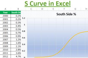
The S Curve represents the cumulative progress of a project over time, demonstrating a slow start, rapid growth, and eventual plateau. This pattern is commonly used in various fields, including:
- Project Management
- Market Analysis
- Product Lifecycle Management
- Financial Forecasting
Importance of the S Curve in Data Analysis
Understanding the S Curve is crucial for analysts and project managers. It provides insights into:
- Project performance tracking
- Resource allocation and optimization
- Identifying trends and patterns
- Making data-driven decisions
Creating an S Curve Pattern in Excel
Creating an S Curve in Excel can be achieved through a series of simple steps. By following this guide, you will be able to create a visually appealing and informative chart that effectively conveys your data.
Data Setup for the S Curve
Before diving into the chart creation, you need to prepare your data. Here is a basic template for setting up your data:
| Time Period | Cumulative Value |
|---|---|
| Month 1 | 10 |
| Month 2 | 30 |
| Month 3 | 60 |
| Month 4 | 100 |
| Month 5 | 150 |
Step-by-Step Guide to Create an S Curve
Follow these detailed steps to create your S Curve chart in Excel:
- Open Excel: Launch Microsoft Excel and create a new workbook.
- Enter Data: Input your data into the cells as shown in the data setup section.
- Select Data: Highlight the data you have entered.
- Insert Chart: Go to the 'Insert' tab, choose 'Line Chart', and select 'Smooth Line'.
- Customize Chart: Add titles, labels, and format the chart to enhance clarity.
- Review and Adjust: Make any necessary adjustments to ensure that the S Curve is displayed accurately.
Common Mistakes to Avoid
When creating an S Curve in Excel, there are several common pitfalls to avoid:
- Not using cumulative data
- Choosing the wrong chart type
- Ignoring axis labels and titles
- Failing to proofread data for accuracy
Case Studies and Real-World Applications
Many organizations utilize S Curves for strategic planning. For example:
- Construction Projects: S Curves help track progress against time and budget.
- Software Development: Visualizing project phases and resource allocation can lead to more efficient workflows.
Expert Insights on S Curve Applications
Industry experts emphasize the importance of S Curves for making informed decisions in project management. This section will delve into insights from professionals across various sectors.
FAQs
1. What is an S Curve?
An S Curve is a graphical representation of the cumulative progress of a project over time, illustrating growth patterns.
2. How can I create an S Curve in Excel?
By setting up your data correctly and using the 'Line Chart' feature in Excel, you can create an S Curve easily.
3. What data do I need for creating an S Curve?
You need at least two columns: one for time periods and another for cumulative values.
4. Can I customize my S Curve chart?
Yes, Excel allows various customization options for titles, labels, colors, and formats.
5. What are the common mistakes when creating S Curves?
Common mistakes include using non-cumulative data and ignoring proper labeling.
6. Where can S Curves be applied outside project management?
S Curves can also be applied in market analysis, financial forecasting, and product lifecycle management.
7. Is there a quicker way to create S Curves in Excel?
Using Excel templates or charting tools can streamline the process significantly.
8. Are S Curves relevant for small projects?
Absolutely! They provide clarity on progress, even for small projects.
9. Can I export my S Curve chart?
Yes, Excel allows you to easily export your chart as an image or PDF.
10. What resources can I refer to for more information?
For further reading, consider resources from Project Management Institute and Excel Easy.
Random Reads
- How to set up a dial up internet connection
- How to transfer files between laptops
- How to transfer files to sd card android
- How to recover your old neopets account
- How to download garageband windows pc
- How to test an oven element
- How to test continuity with a multimeter
- Check ethernet cable
- Change windows computer screen saver
- Ultimate guide level up fast wizard101